The last time I went to Kyoorius Designyatra was in 2007. It was raining heavily in Goa and the conference venue (a gigantic white tent) was sunk in water. Complete chaos reigned in terms of the conference’s organization, with speakers not showing up or backing out at the last minute and I had mixed feelings at the end of it. This is what Indian design was about? I revisited the event again this year. The rain was on in full force when I landed and I wondered if it was an omen, but thankfully, my experience this year was different.
The conference has grown over the past 5 years. The venue these days is not a tent but a 5-star hotel and it is now run in a well-organized manner by Rajesh Kejriwal, Kay Khoo and their passionate Kyoorius team. The last time, I heard international design superstars like Harry Pearce from Pentagram UK and the US based Stefan Sagmeister but I also suffered through boring and endless presentations by Indian presenters like Piyush Pandey (seriously, how many times can we hear about and see Fevicol ads, and his was the best of the lot!). Also, mostly, the talks were about graphics and advertising and the crowd was a repeat of what you might find at the Goa Adfest.
This year the conference went much beyond advertising. Attempts were made to think of design as an integrated solution-oriented process. What was especially exciting for me was that the Indian speakers were the most powerful this time and drew the most roars of appreciation from the audience. Two people I’d already encountered before at TED and INK were the biggest hits of Designyatra. They were Mansukhbhai Prajapati, the inventor of Mitticool, a clay refrigerator that runs without electricity, and Arunachalam Muruganathan, who literally had the crowd standing up out of their seats and clapping throughout, as he explained how he shed blood, sweat and tears to design his revolutionary low-cost sanitary napkin for India and the world.
The theme for this year’s yatra was “the divide” and it was explored imaginatively, right from the Divide Illustrated project that had different graphic designers showcase their work in a well-produced book, to the Twitter feed from the event that was displayed live on the conference screen after each session. This act blurred the divide between speakers and the audience for sure, made it easy for the people on stage to quickly reply to audience comments making the Q&A sessions truly interactive. However, some divides were not breached, and here I’m referring to the red tape drawn halfway across the conference room, which kept the students who were attending at the back, separated from the speakers and the professionals. Oh well!
Among the different speakers, I really enjoyed listening to Nic Roope. Roope is the Creative Director and Founding Partner of the interactive design firm Poke and the product design company Hulger in the UK. At the conference, Nic asked us: “Isn’t it strange that the bulb, an object so synonymous with ideas, is absent entirely of imagination”? He explained that the lighting market was growing 700 percent annually. People were replacing their old lighting with new energy efficient systems. However, most light bulbs were boring and there were no designer bulbs, or design led lighting brands. (Except Philips, maybe.) So he and his creative team at Hulger decided to make an exciting designer light bulb.
After experimenting with different models of bulbs in neon shops until they got the shape they wanted. Their product, the Plumen 001 is the world’s first designer energy saving light bulb and it was awarded the Brit Insurance Design of the Year in 2011 and recognized by the Victoria & Albert Museum in London, the Finnish Design Museum and the Cooper Hewitt collection in New York. They are now ramping up sales of the Plumen all across the UK as well as in other parts of the world. They’re selling at Le Mill here in Mumbai, Bombay Electric already has a whole bunch of them illuminating their store, and I’m soon going to get my hands on some for my home; they’re (pun alert) brilliant.
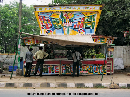
A lot of the talk at Kyoorius Designyatra was about typefaces. I found this very interesting. In an era of computers and fonts, there is suddenly this resurgence of typeface, and an interest in the old. I was happy to encounter Hanif Kureshi from the Delhi based Wieden+Kennedy. Not to be confused with the author from England, that’s Mr. Kureishi, please. The Hanif I met was 29 years old and grew up in a town called Talaja in Gujarat surrounded by all kinds of hand painted signs that advertised everything from soft drinks to cinema. He badly wanted to be a sign painter as an adult. But after he grew up, he realized that the hand-painted business was dying as hand painters, with the advent of local Desktop Publishing shops, were going out of business.
Hanif sensibly chose advertising as a career but eventually decided to do something about his childhood passion. First he made a film called Painter Kureshi, which is pretty awesome. (Google in online and see it.) Then, he started an ambitious project called Handpainted Type, which is dedicated to preserving the typographic practice of street painters around India. The project involved tracking and documenting the typefaces of roadside painters across India and digitizing these so that they serve as a resource for present and future generations.
Kureshi asks each artist he finds (often by calling up their mobile numbers, that they now paint on the side of their hand painted hoardings, to get more work!) to paint all the letters in the Latin alphabet, all the numerals and all the symbols. He has begun to create digital fonts from these letters, named after the painter who made them. So far, two fonts are ready on his website; one is available for free and another is for a paid download. The paid font, Painter Kafeel, is my favourite; it is available in English Hindi (Devnagri) as well as Urdu script, for 50 US dollars of which 25 will go to the original painter and 25 will go to Hanif’s Handpainted Type project.
At Designyatra, I also became aware of another Indian type related project – Satya Rajpurohit’s Indian Type Foundry, which launched new typeface Engrez Sans at the event. The Designyatra organizers had created all their event collateral using this font. I had no idea we even had an Indian Type Foundry! I learnt that the Foundry was established in 2009 to create typefaces for the Indian market and the world and that it also serves as an educational platform for typography through lectures and workshops. The intention is to give the same attention to Indian typography as Latin typography has received in the last few decades.
A commitment to the local was also the crux of architect Ambrish Arora’s Designyatra presentation. I have known Ambrish for many years now. I have stayed with pleasure at Jodhpur’s Raas Haveli, which he designed, and shopped with delight at the Rohit Bal stores in Mumbai and Delhi, that bear his unmistakable Lotus motif stamped on them. At Raas, I clearly remember my first moment of “wowness”. I had been brought from the airport in a car and dropped outside the old city, where a powder blue Raas rickshaw was waiting to collect me. As we stopped outside the gate of the haveli, I did not know what to expect. Then I entered, walked down a narrow corridor between the outside gate and an inside door while rose petals were showered on to me. As I entered the main property, there was a dramatic reveal – the entire property just seemed to loom up around me, with the Meherangarh Fort presiding above. It was a spectacular experience.
Ambrish is a self-taught designer, he began his career by designing boats, teaching in schools, working in cinema and exhibition and museum design, before finally setting up Lotus, his firm focusing on interior design and architecture, 10 years ago. Lotus has received national and global acclaim for its projects as well as for its principles of conscious design – an approach that celebrates local resources, cultural influences and a keen sensitivity to the impact of the project and process on all stakeholders.
At Designyatra Ambrish told us about how whenever he gets a brief that is too open ended, he tries to either induce conflict or context or both to make it work. So at Raas, which is a 1.5-acre property, their client said that there was no constraint on the expense or design they could make. But Ambrish put his own constraint; that his team would only use local materials and craftsmen sourced from within Jodhpur. The materials they finally chose included hand cut stone, poured in situ pigmented cement terrazzo on floors, walls and as furniture, and locally crafted furniture and cabinets in sheesham hardwood.
He told us that when they first went to the site, they found three decrepit 17th-18th century buildings set in a large courtyard and nothing else. These old buildings were painstakingly restored with traditional craftsmen in the original materials such as lime mortar and Jodhpur sandstone and they now house shared spaces to be enjoyed by all the hotel guests, such as the pool, dining areas, a spa, and an open lounge area. Ambrish then inserted new baby blue buildings into the site in such a manner that these new buildings formed a relationship with the old buildings and the Fort, creating a dialogue between the old and the new.
As Ambrish said to us at the conference, good design is about “authenticity”. Designers today are integrators – bringing together the outside and inside, old and new, crafts and technology, to create something magical. He shared similar experiences of his design constraints and contexts with other properties such as the Gaurav Gupta store at Delhi’s Emporio Mall, where he had his craftsmen twist scissors into magnificent shapes that were used all around the store. He also had fabrics twisted tightly and made into moulds and he used the moulds to shape the frames of the mirrors in the store. He also inserted floating mannequins among other quirky elements to give the store an other-worldly fantastic touch.
* This post is a modified version of my column Parmesh’s Viewfinder which appears in Verve magazine every month.